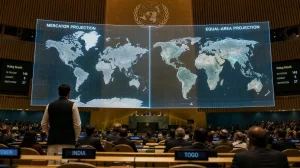
You are about to see your sense of distance challenged with a new world map. The UN has endorsed the Equal Earth for its accuracy in showing the true size of continents; it is a move that could well reshape our mental picture of the planet, as well as what goes on in the classroom and how we plan our travels.
What changed at the UN
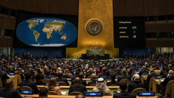
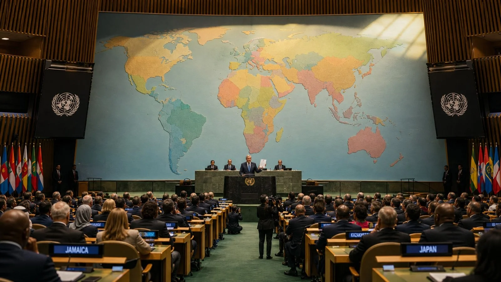
The General Assembly has put behind it a resolution to urge institutions and countries to make use of the Equal Earth projection. While there is no legal mandate to it, the endorsement is a signal of things to come for technology, education and beyond.
The record shows 164 nations voting yes. The US was in opposition and six – Serbia, Estonia, Georgia, Lithuania, Moldova and Ukraine – abstained. Those in support would say the decision speaks to how representation is tied to power, dignity and the decisions of daily life.
Why the old map misleads
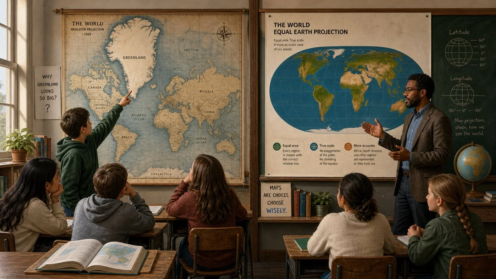
One does not look to the Mercator for fairness of area; it was made for navigation in the 16th century. Its tendency to stretch the poles and compress the equator warps our view of the world in subtle ways.
Hence why Greenland has for so long appeared to be the size of Africa on a classroom wall. In fact, Africa is some 30.3 million square kilometres while Greenland is 14 times less. These kinds of distortions have lent themselves to narratives that put too much stock in certain regions and shortchange others.
Proponents of the change see it as a way to counter those hierarchies. With the Equal Earth you get a proportional size that makes Europe appear as it should, and allows Africa and Latin America to be seen in their full immensity.
Five places your map has been shrinking
For the traveller, the new projection offers some hard facts where geography used to be abstract. It will put a different spin on expectations when you are making plans.
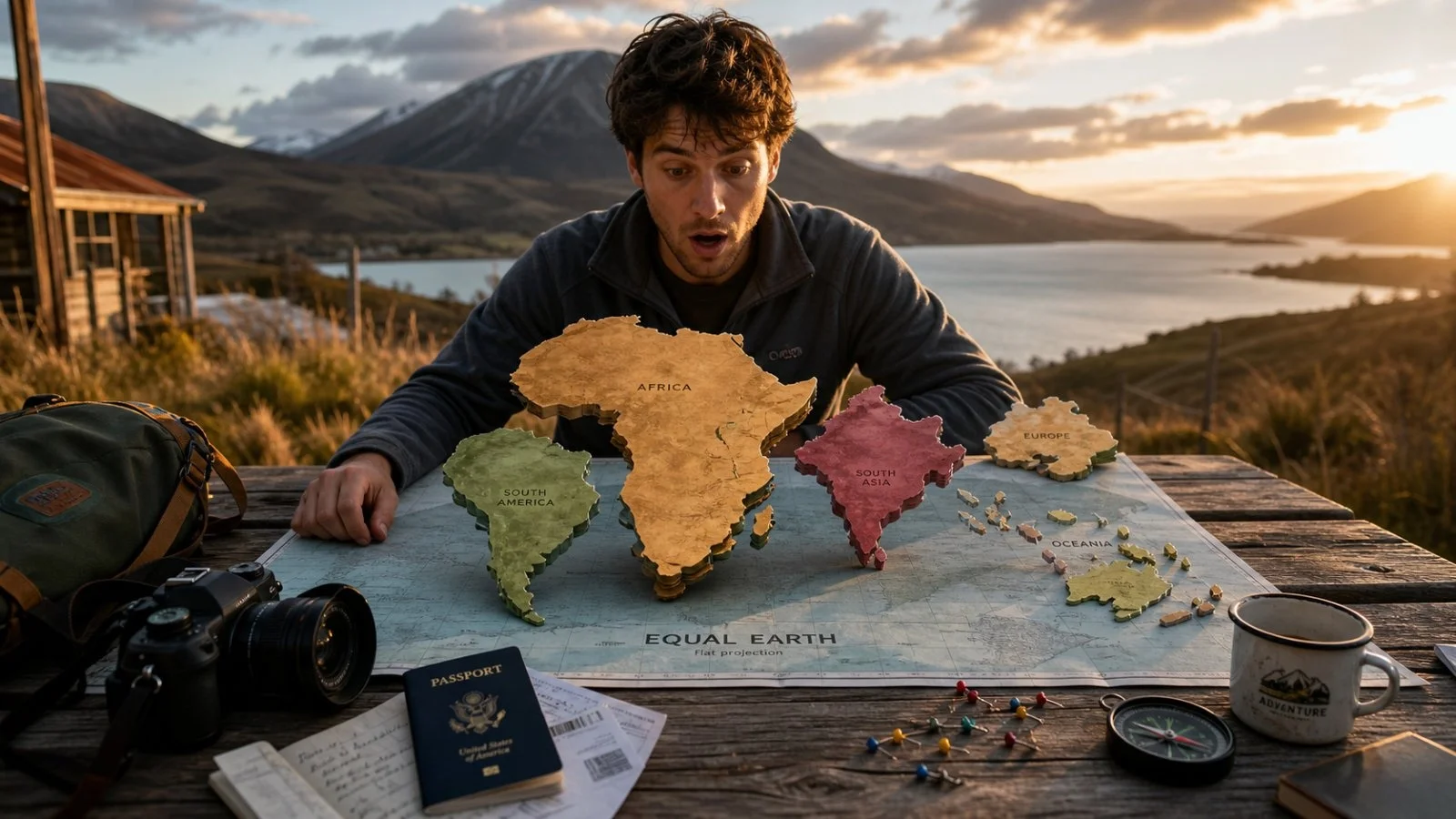
Africa is the obvious case in point. At 30.3 million square kilometres it puts to shame many places that seemed comparable on a Mercator. An itinerary that takes in Kenya, Morocco, Zanzibar and South Africa is crossing vast swaths of culture and ecosystem.
On a wall map South America can seem like a quick hop. But the continent is closer to 17.8 million square kilometres, or 20 million if you take in all of Latin America. There are slow overland legs and long-haul flights to contend with.
South Asia might look compact but it is not. India, Pakistan, Bangladesh, Nepal, Bhutan, Sri Lanka and the Maldives make up some 5.1 million square kilometres of shifting landscape and a quarter of the world’s population.
Many an itinerary underestimates Oceania. Australia alone accounts for most of the 8.5 million square kilometres here. Do not think of Sydney to Perth or Cairns to Uluru as a weekend affair; the terrain and seasons do not allow for it.
Then there is Europe, the odd one out in terms of perception. It is a mere 10.2 million square kilometres against Africa’s 30.3 million. That kind of compactness lends itself to multi-country trips you would not attempt on a larger landmass.
How to plan travel with the new scale
Bojan Savric, Tom Patterson and Bernhard Jenny put together the Equal Earth in 2018 to keep shapes recognisable without sacrificing relative area. For a traveller it is a useful tool in planning, not just a cartographic exercise.
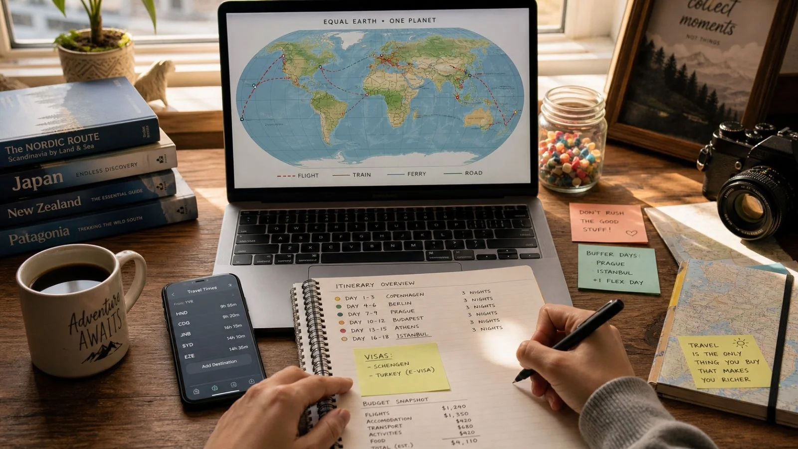
Let the map set the tone for your time and energy. When the proportions are right, it is simpler to put aside days for overland travel and know your climate zones rather than force an overstuffed schedule that only looks good on a distorted chart.
Put it to work on your next trip in these ways:
– Look at flight times, not the dots on the city
– Be realistic with overland days when grouping destinations
– Fewer bases, longer stays
– Make of Africa several trips, not a single one
<p data-id=”25)- Build in some weather buffers for South America
– Check the regional seasons in Oceania
None of this alters the physical size of anything or redraws borders, but the UN has in effect changed our representation of the world we inhabit. We tend to consult a map first when we are dreaming or prioritising.
There is something empowering and humbling in seeing a place for what it is. As apps and schools go with Equal Earth, it is an invitation to fairer expectations and better routes. Our journeys can be based on a map that corresponds with the miles.